Develop a cinematic show open and package for the new documentary series,
LA Fire & Rescue, worthy of the true everyday heroes of the
Los Angeles County Fire Department.
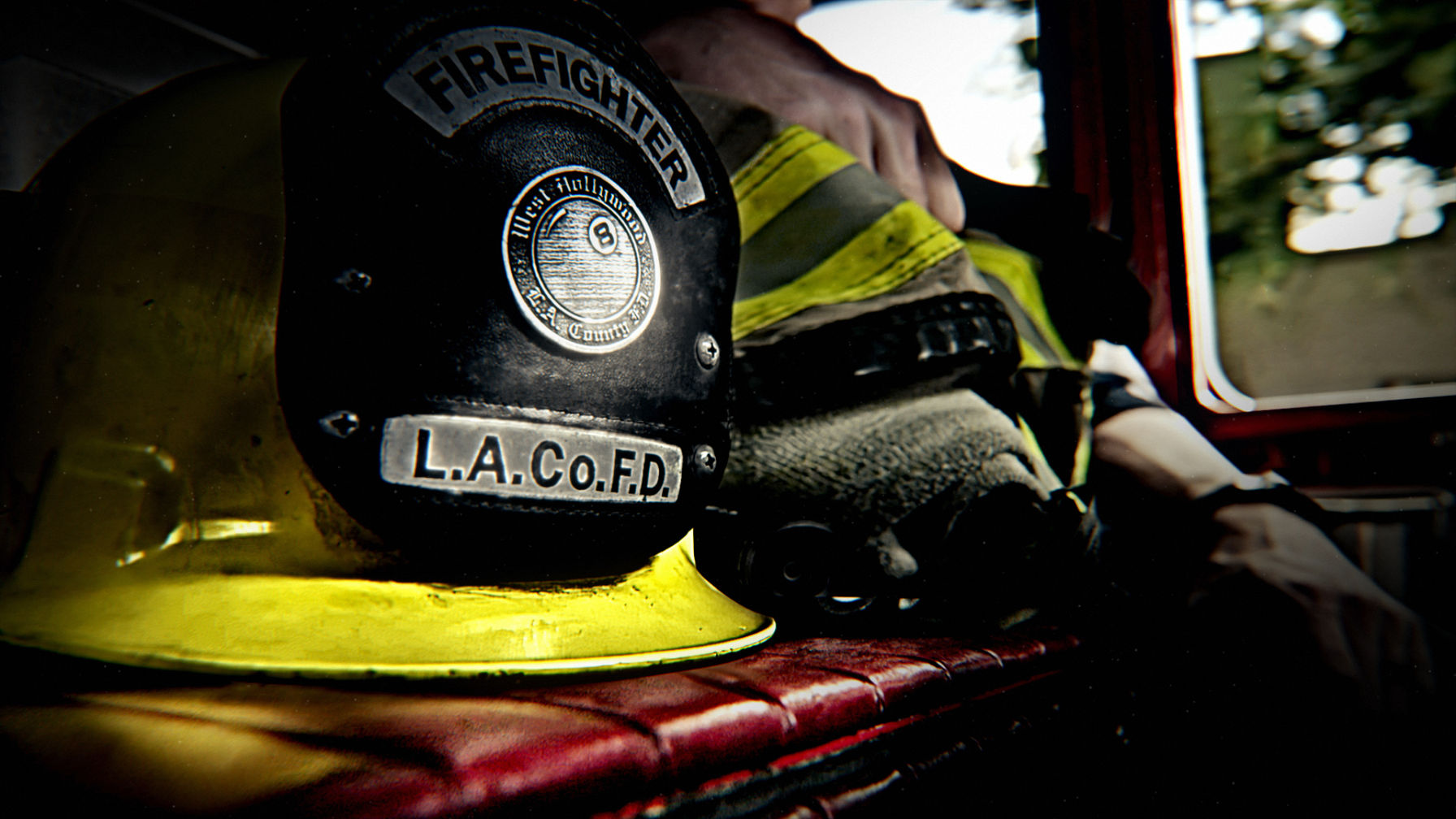
Through discussions with the showrunners, a common theme emerged
for the tone of the show:
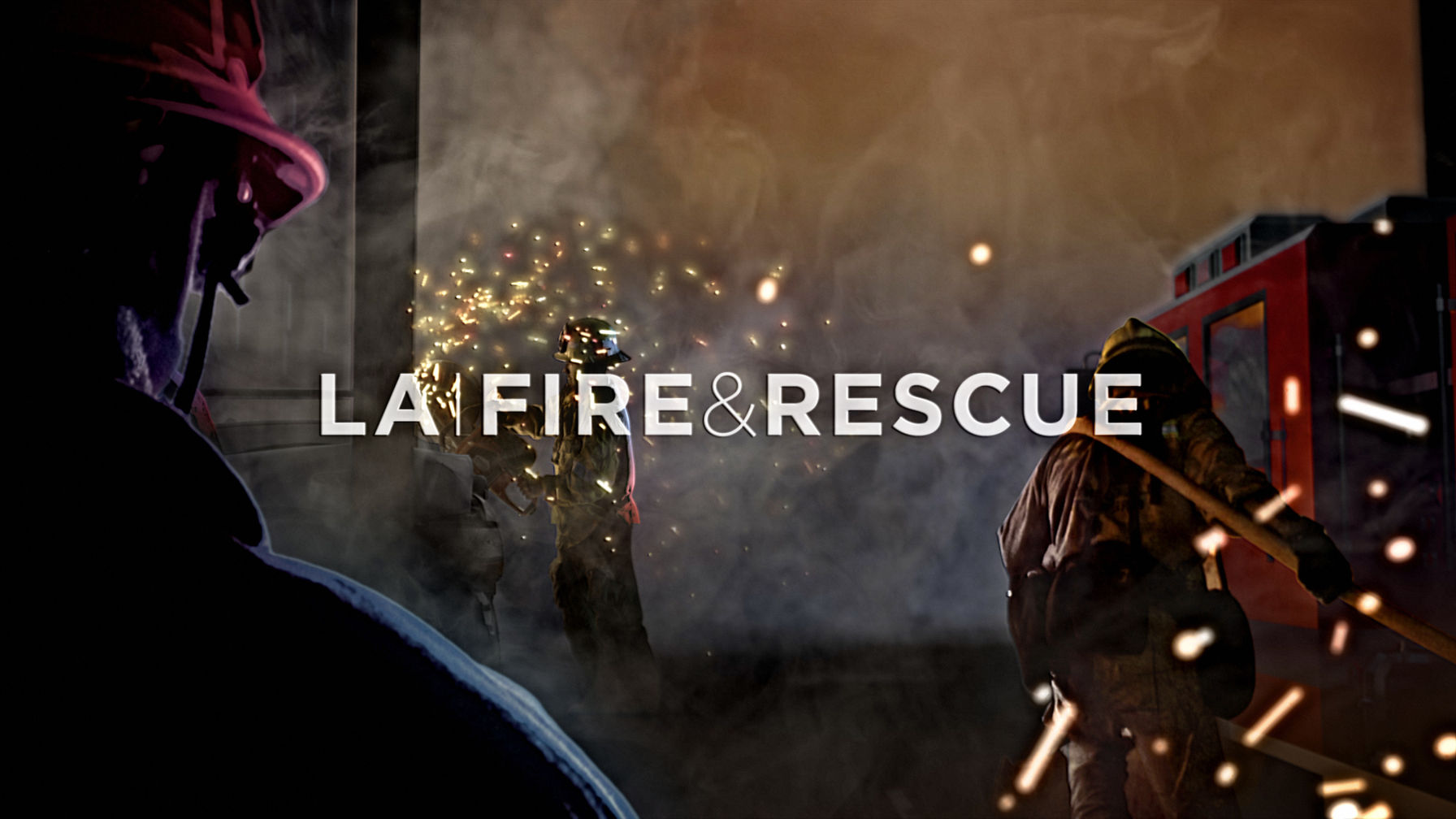
We developed the idea that when time stands still, we continue to see
the heroism and strength of LA’s First Responders.
We called the concept ‘Origin Point’.
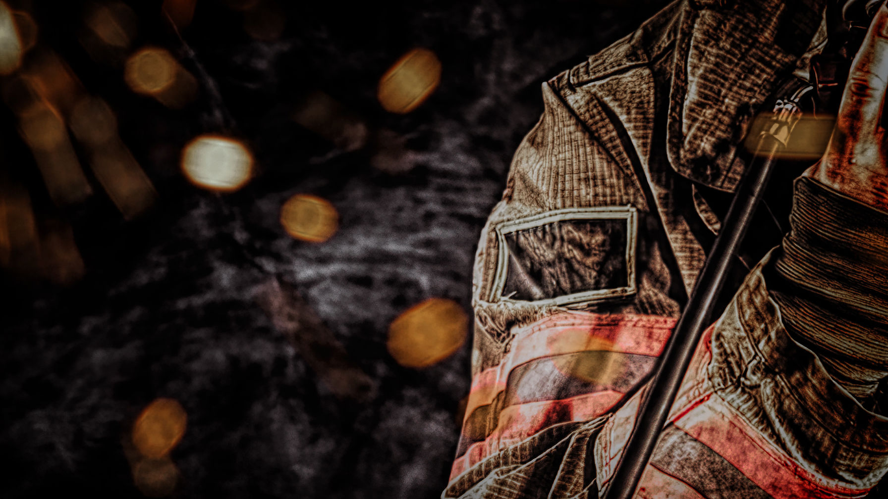
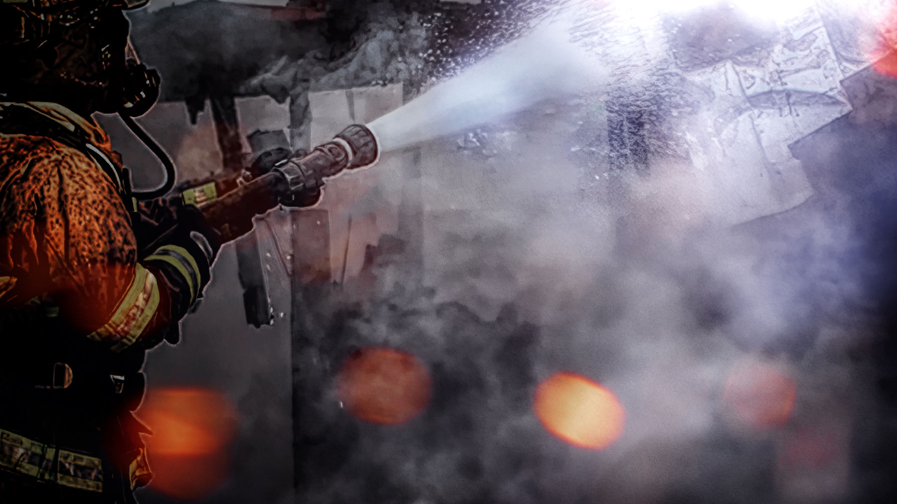
We expressed the tone through textures and details taken from the
everyday tools the rescuers depend on. We made those conceits central
to our design, building out dramatic, mid-action frozen vignettes.
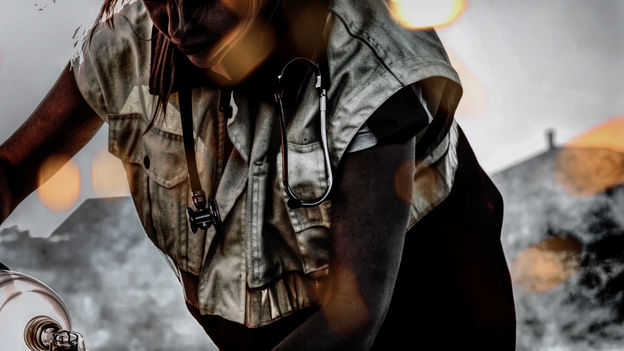
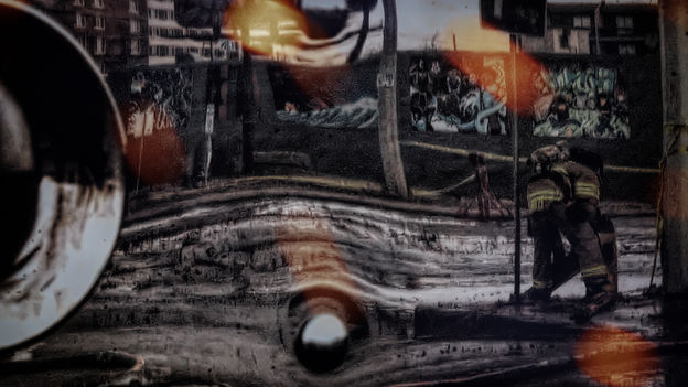
We explored the potential of these moments through motion tests, built
from stills we shot at the stations. The shots were brought to life and given
depth through CG modeling and projection-mapping, augmented with 3D particles.
This allowed us to create dynamic camera moves, but at macro scale.
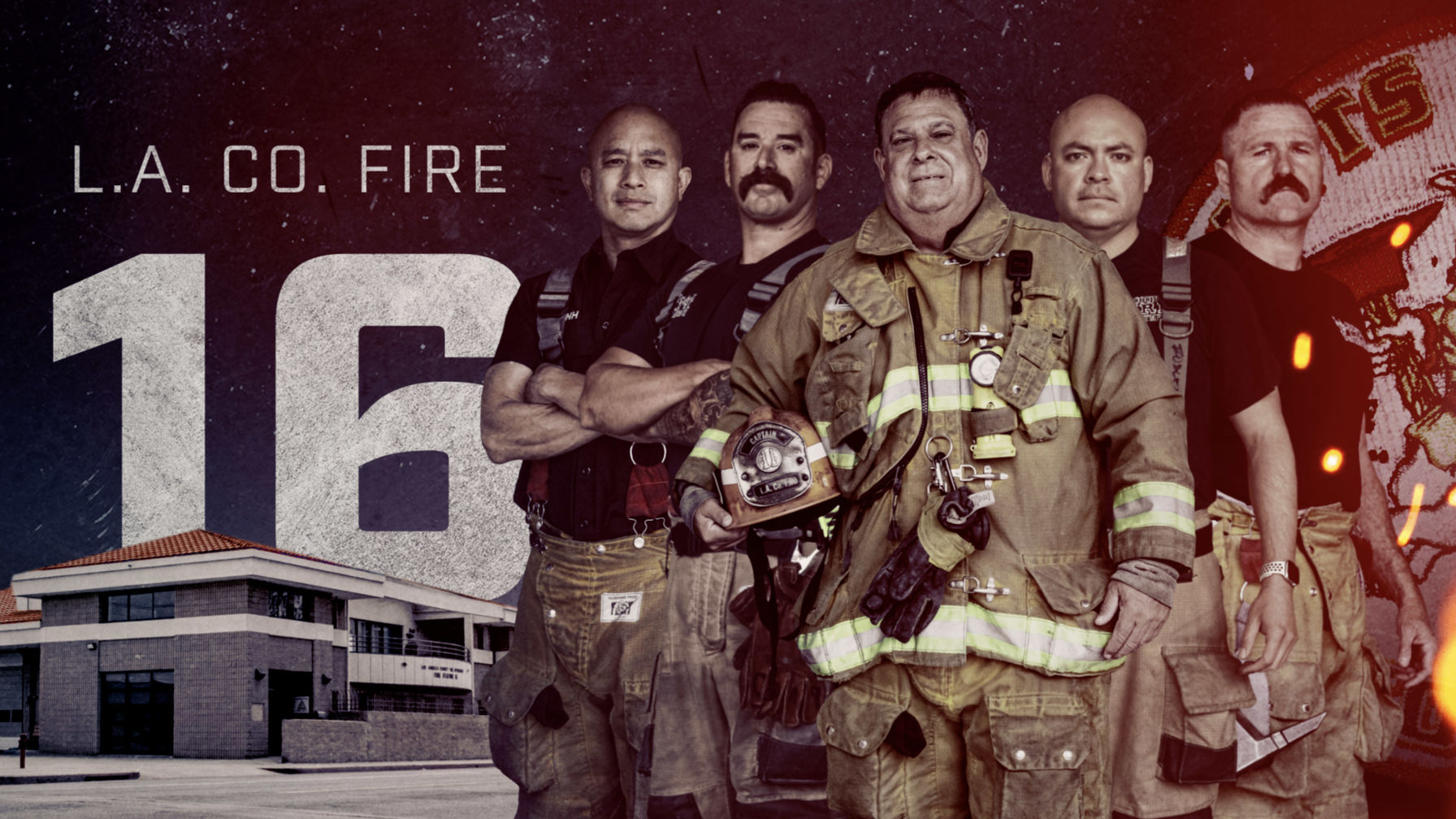
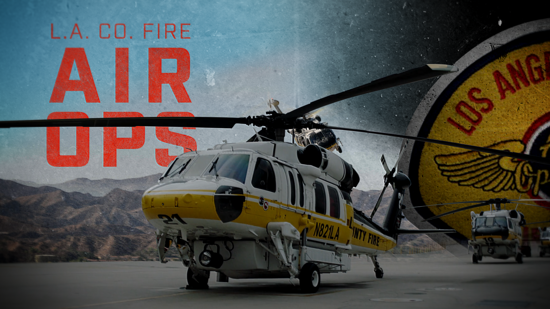
The show follows 6 different LA County Fire & Rescue Stations spread
across the city. Each has its own character, from the leaders to the rookies,
and even to the patches on their uniforms.
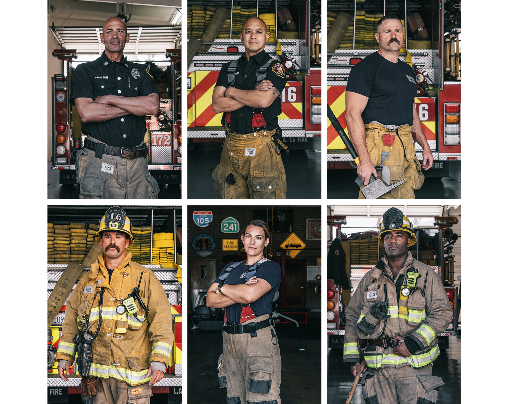
We spent a lot of time in fire stations capturing all the key members,
their engine and the station.
The logo had to reflect the same themes as the open.
It had to have strength and a seriousness, while being approachable
and easy to connect with. We explored a bunch.
An important structural need for the logo was to create space for the
possible evolution of the show. With the simple line separation, the show
could become NYC or Chicago.
The ampersand is a nod to Dick Wolf's other franchise shows.
It was truly an honor to work on such a meaningful and inspiring show.