Paramount+ provides an assortment of news programming, from hard-hitting
to more casual, and everything in between, which led us to the concept:
M O O D S T A T E
Whether the audience needs a trusted ally, a ‘get up to speed’,
or a gentle morning companion, Paramount+ has that mood.
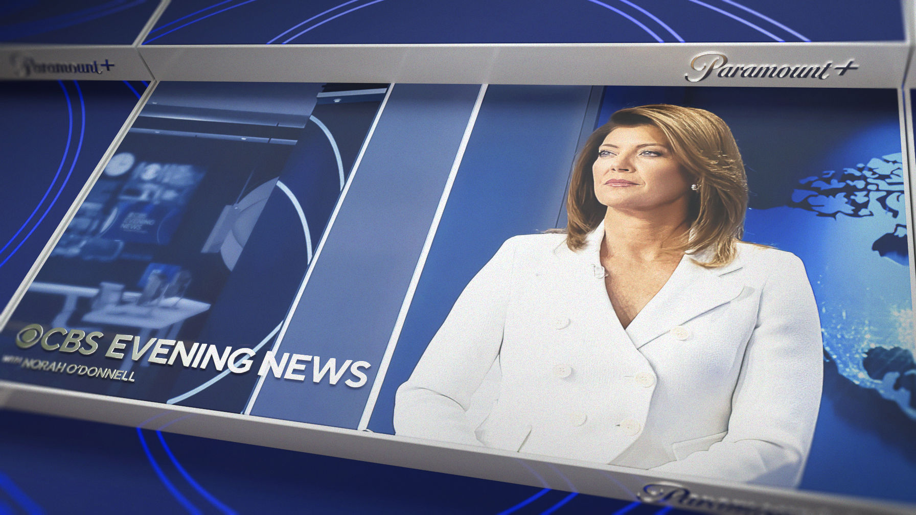
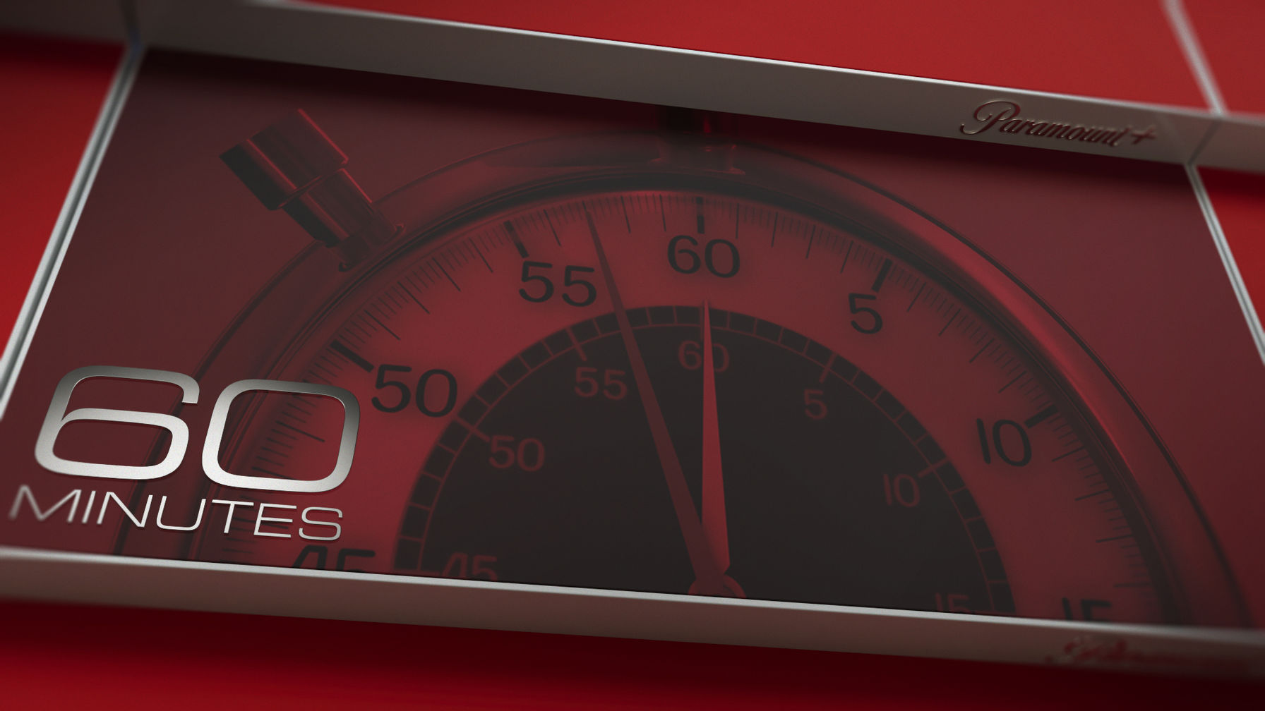
We combined the colors of the shows and the brand of each network
to express the variety on offer to their audience.
The three key attributes to express ‘Mood State’ visually were:
Fast, easy access to the news.
Variety of choice, from serious news to humor.
And simplicity of the UI experience.
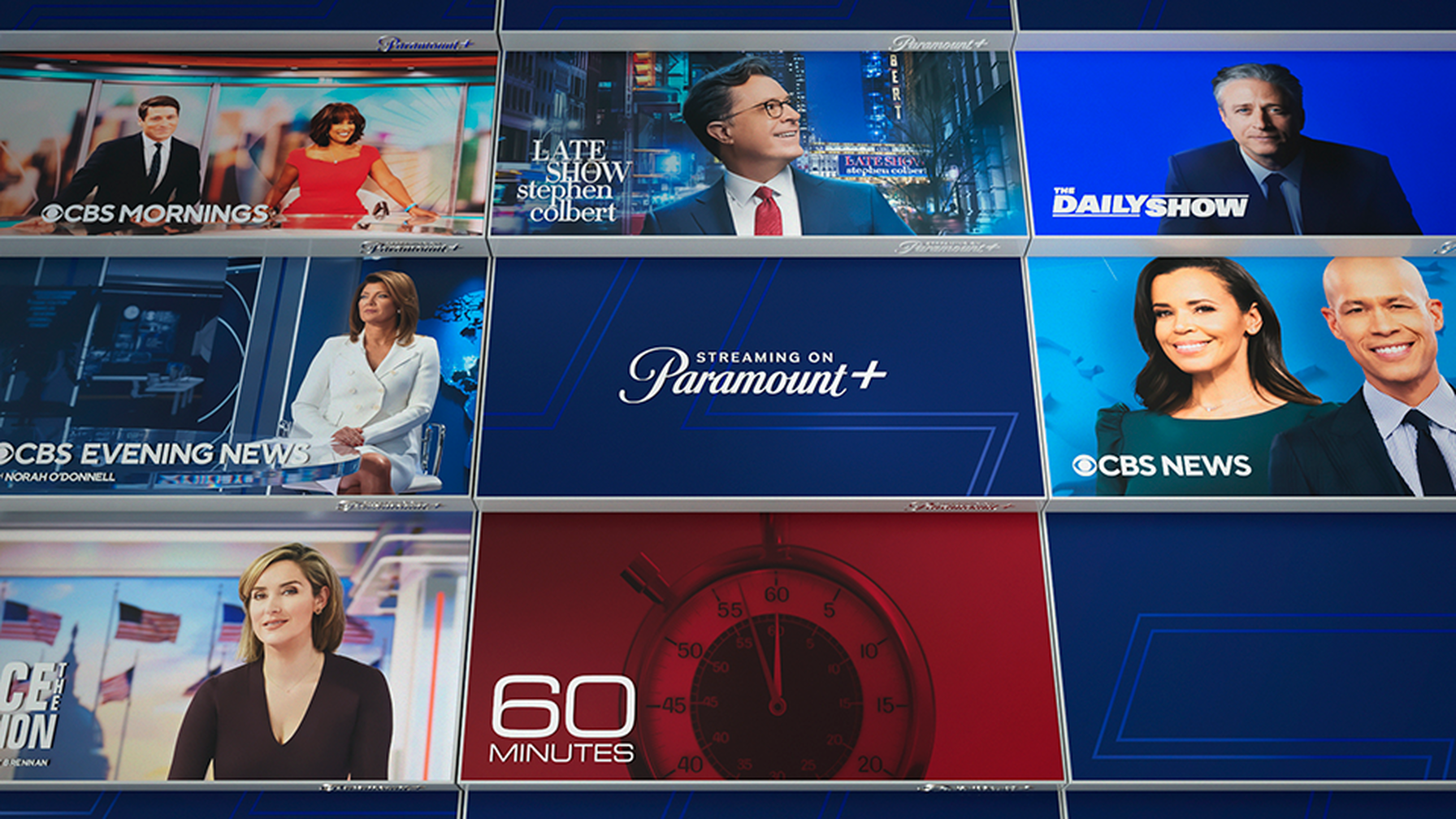
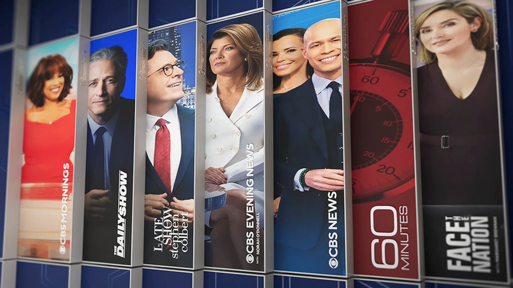
Building from this initial concept base, we created a toolkit that enables
the brand to live on post-election. An approach that, through consistency and
opportunity, helps Paramount+ connect with new habitual news viewership.
Here is one of the first spots using the new brand.