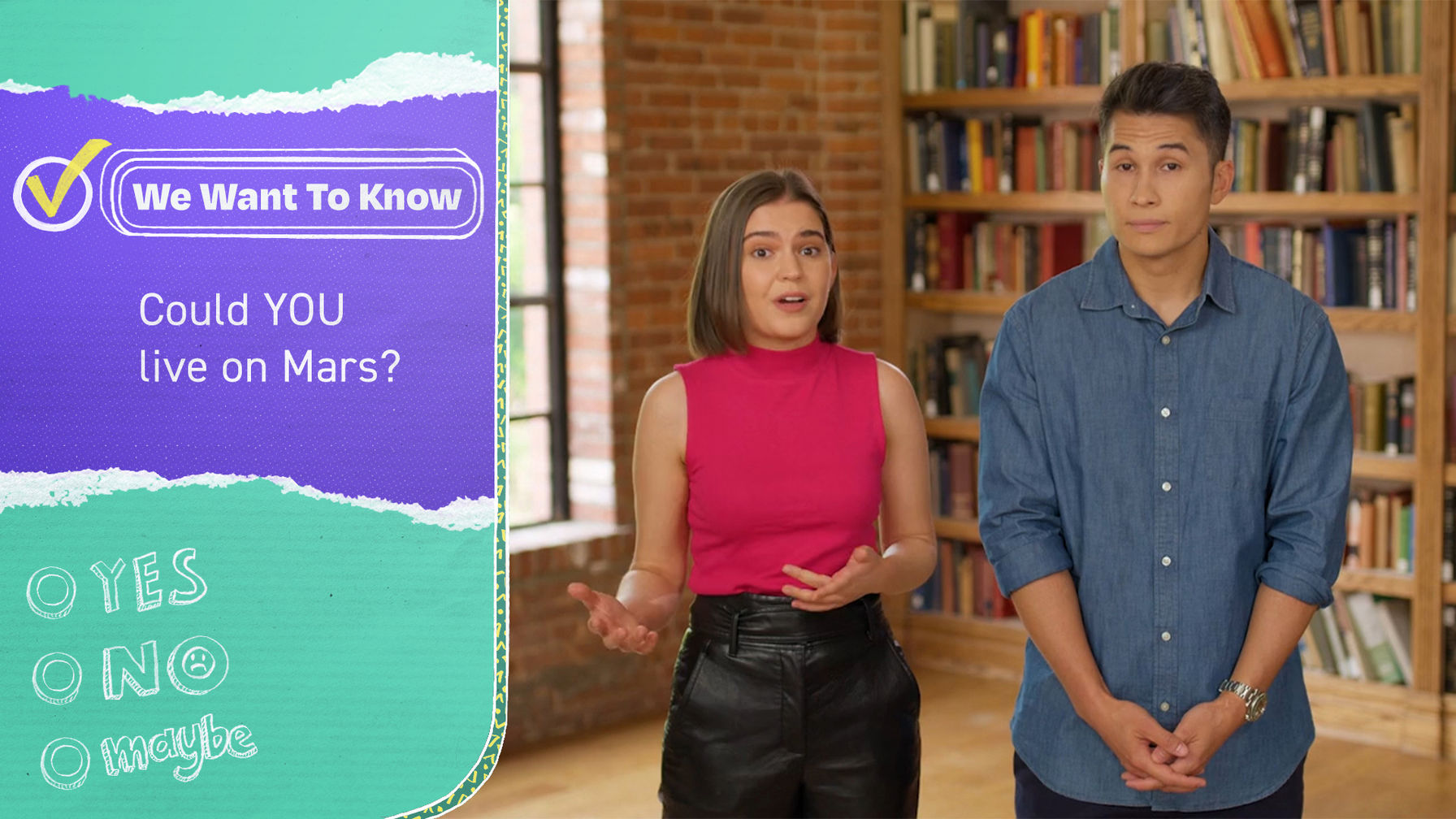
When the target audience for a project is described to you as
inquisitive and aware, knows "fire" means amazing, and wants to sit at the
adult table but is happy there's still room for them at the kid's table,
you know you've got to be involved!
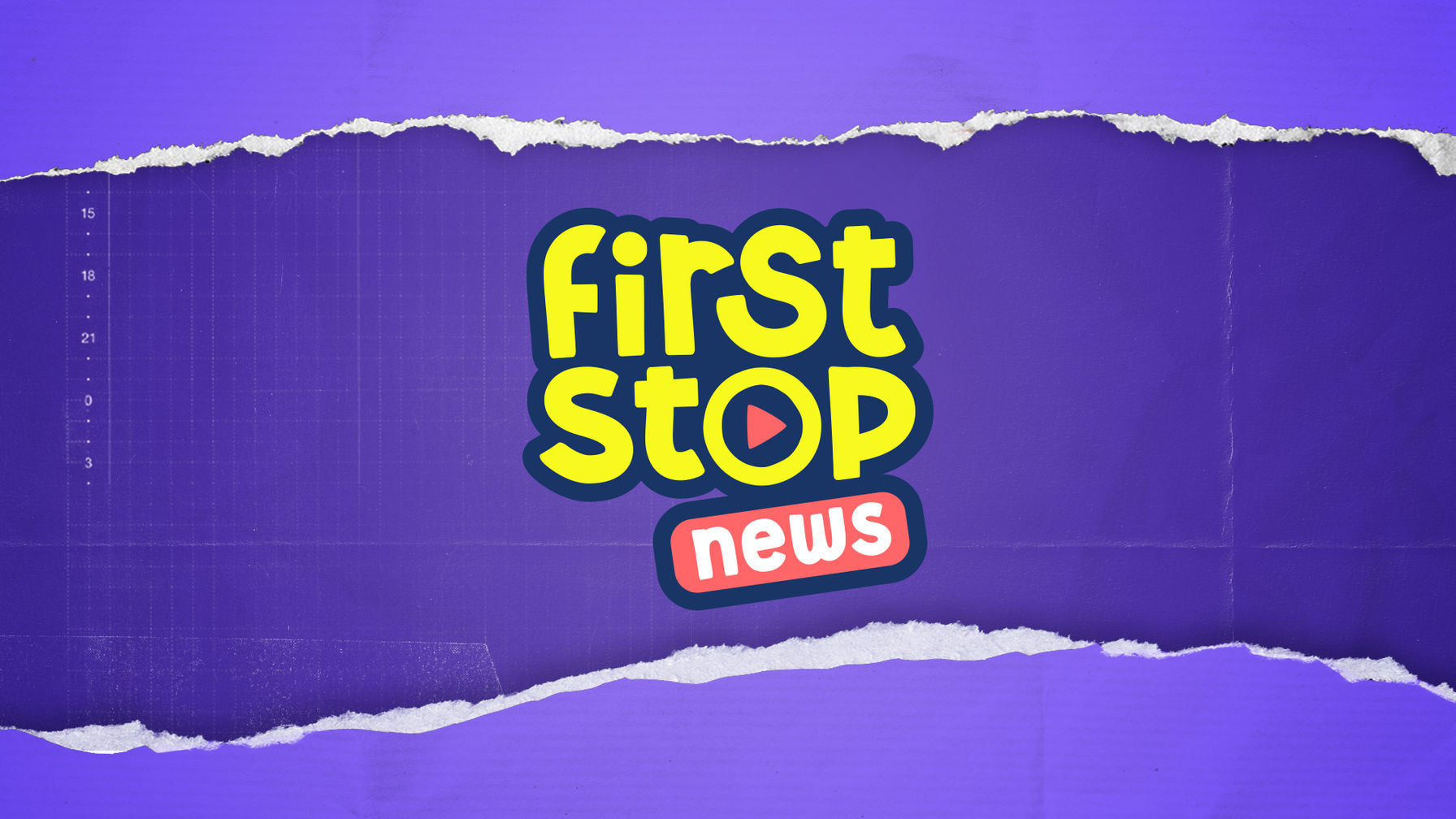
First Stop News is informative, accurate, vibrant and fast-paced with a
healthy dose of fun. The logo exploration needed to find the line between
structured, fun, and handcrafted...and did we mention FUN?



For a news show dedicated to 8-to-13-year-olds,
the logo had to have a bright, bold personality.
With the show team's own kids as the judges, it had to be their vibe.

Pop! A surprising and joyful moment of purposeful movement became our motion principle.
We used this to bring the logo to life and express the personality of the brand.
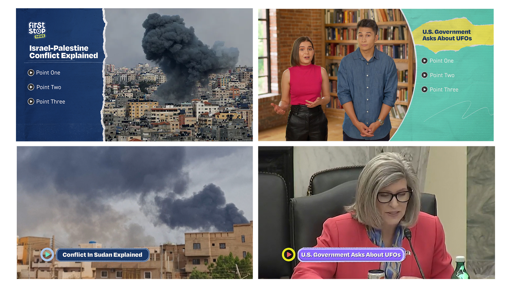
As a news show for kids, the design had to flex from
light "cat stuck up a tree" stories, to explaining the reasons behind a war.
We found the answer in ‘Handcraft.’ The handmade, playful craftiness enabled us
to be irreverent and fun, while the energetic layers and textures
could be peeled away to be more serious.
We designed a toolkit with ‘Story Range’. Headlines and info graphics
with setups that mirrored each other but wear different skins.

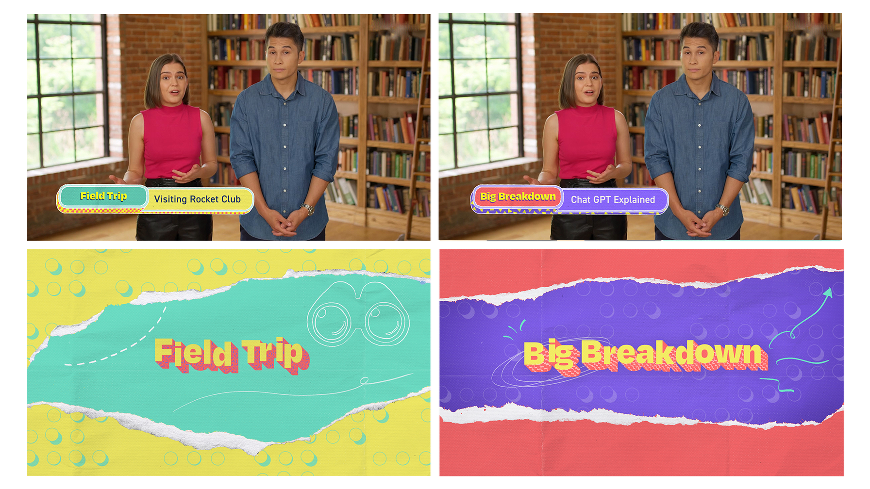
We created an easily expandable franchise design for
Big Breakdown and Field Trip, with more segments like The Interview coming soon.

The First Stop News audiences want to be involved, to be challenged,
and to learn in a fun way. The show poses questions daily, with some answered
in show and some later online.
